


My HomeScreen
3.714.00 Reviews
App Specs
- Version
- 2.0.4
- Updated On
- License
- Free
- Downloads
- 10,000+
- Developer
- Tiki Media LTD
- Categories
- Personalization
- Platform
- Android
Screenshots
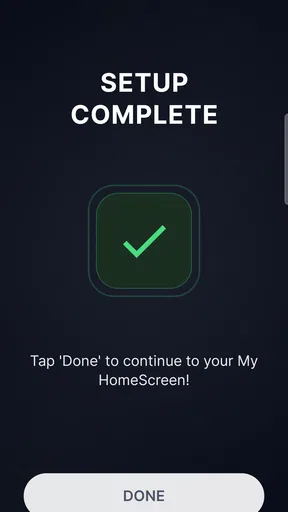
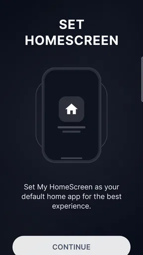
 Analysis by AppCompare
My HomeScreen is the kind of personalization app that tries to make the first screen of your phone more useful, rather than treating it as a simple grid of icons. I spent time looking at it as an everyday launcher: opening apps, checking the built-in tools, watching how the news feed fits into the home screen, and considering what happens when the phone is being used in less-than-perfect network conditions. My overall impression is that its appeal comes from combining several small conveniences in one place, although that same combination can feel busier than a traditional launcher.
Developed by Tiki Media LTD, the app is free and aimed at Everyone. It belongs to the personalization category, runs on Android 8.0 or later, and is currently at version 2.0.4. Its store summary presents it as a smart launcher with built-in tools and a live news feed, while the short description simply calls it My HomeScreen. That concise identity is accurate: this is less about dramatic visual customization and more about changing how the home screen behaves during ordinary phone use.
How the connected home screen feels in daily use
I’d use the home screen as a quick decision point: first decide which actions should remain easy to reach even when the live feed is slow, then arrange the rest around them. That small distinction helps separate dependable shortcuts from information that depends on a connection. It also makes the next question more useful: how does that balance feel once the phone becomes part of an ordinary day?
A useful first screen, not just a decorative one
The strongest idea here is the attempt to turn the home screen into a starting point for information and actions. A conventional launcher usually gives me icons, folders, widgets, and perhaps a search bar. My HomeScreen adds a more active layer by bringing tools and news into the same general space. That can save a few steps when I want to glance at something before opening a separate app.
I found this most appealing when I treated the screen as a quick dashboard rather than a place to browse for long periods. The difference matters. If I want a calm, nearly empty screen with only a few carefully arranged icons, a minimalist launcher is likely a better fit. If I want the first screen to change with current information and provide more immediate utility, this approach makes more sense.
The live feed is also where connectivity becomes part of the experience. A news area is inherently more useful when it can refresh, and less useful when the phone is offline, in a weak-signal building, or operating under strict data limits. I would not install this expecting a completely self-contained launcher. I would install it because I am comfortable with a home screen that becomes more informative when the network is available.
What happens when the connection is doing the work
Connected moments are the app’s natural territory. When the feed can update, the home screen feels more like a current information panel than a static background. That may suit someone who checks headlines in short bursts throughout the day. It can also reduce the habit of opening a separate news app simply to see whether anything new has appeared.
Worth Reading Before You Choose

Flipboard Shows What News Apps Must Do Beyond the Feed

Switching to Android Auto Means Rethinking Your Driving Routine
Google Calendar Makes a Crowded Week Easier to Manage

Ludo King Makes the Most of the Minutes Between Plans

Baby Panda World Brings Quick Play to Modern Phones, but Its Game Library Feels Busy

ESPN’s Live Game View Makes Following Close Games Easier
There is a trade-off, though. A changing feed competes for attention with the apps and shortcuts I deliberately placed on my phone. People who already feel overwhelmed by notifications, headlines, and constantly changing content may find the extra layer distracting. In my experience, the best way to use this style of launcher is to decide what the home screen is for before customizing it. If it is meant to help me act quickly, I should keep the surrounding layout simple. If I let every available element compete equally, the convenience becomes visual noise.
Another practical point is that the news feed should be treated as a glanceable feature, not a replacement for a full reading experience. A home screen has limited space and encourages quick scanning. For deeper reading, source checking, or saving articles for later, I would still move into a dedicated news application or browser. My HomeScreen works better as the doorway than as the entire destination.
Using it while moving between places
The mobile context is important because launchers are used in awkward situations: walking between appointments, standing in a queue, riding public transport, or trying to reach one app with one hand. In those moments, a useful home screen should reduce searching. The built-in tools can help when I need a quick action without committing to a separate app, while the feed can provide a brief update during a spare minute.
I would be more cautious when using the live content on a crowded commute. Network quality can change quickly between streets, buildings, stations, and vehicles. A feed that feels immediate in a strong-signal area may take longer to refresh elsewhere. That does not make the launcher unusable, but it changes how I would depend on it. I would keep essential communication, travel, payment, and work apps easy to reach independently instead of assuming that the connected home screen will always be ready at the exact moment I need it.
For a person who frequently switches between personal and work tasks, the combined layout can be helpful if it is organized around routines. I would place the apps I use during the morning near the easiest reach area, keep less frequent tools grouped away, and treat the news portion as optional rather than central. This is a small but meaningful distinction: the launcher becomes more practical when my own habits determine the layout, instead of allowing the live content to dictate it.
A realistic everyday scenario
Imagine starting the day by unlocking the phone to check the next appointment, open a messaging app, and scan a few headlines before leaving home. With a conventional launcher, those actions may involve several separate screens or apps. My HomeScreen can make the first glance more unified, particularly when the connection is good and the built-in tools match the tasks I repeat.
Later, during a short break, I might return to the home screen to check whether anything new has appeared in the feed. If the network is temporarily poor, I would not keep tapping refresh or assume that the absence of new content means there is no news. I would use the screen for the shortcuts that are already available and open a dedicated app when the information itself becomes important.
That workflow shows both the strength and the limitation clearly. The app can make repeated, lightweight checks feel more direct, but it should not become the single point of failure for time-sensitive tasks. I like it as a convenient front door; I would not make it the only route to essential information.
Failure, waiting, and recovering gracefully
Any launcher that includes live information needs to be judged not only by its best connected moments but also by what happens when the connection is slow or interrupted. This is where expectations matter. A traditional launcher remains predictable because icons and folders do not depend on a current feed. My HomeScreen has a more dynamic personality, so the experience can feel less immediate when the network is unavailable.
My practical advice is to separate “launching an app” from “loading online content” in your mind. If a connected panel is slow, I would use the normal app icon or search route instead of repeatedly waiting for the feed. Keeping key apps in familiar positions also makes recovery easier. This is one of the less obvious setup decisions that can make the app feel much smoother: design the screen so that a delayed feed does not block the actions you perform every day.
I would also avoid judging the whole launcher by a single stalled refresh. Connection problems may come from the current network, not from the basic idea of the home screen. At the same time, repeated delays would be a valid reason to return to a simpler launcher. A personalization app should reduce friction overall; if its connected elements regularly make the first interaction slower, the extra information is not earning its place.
Recovery is easiest when I keep a fallback habit. For example, I can open the relevant news app directly when I need a complete update, or use a standard browser when a headline requires context. I can also rely on the phone’s ordinary app drawer for access to tools that are not visible on the first screen. This makes My HomeScreen part of my setup without forcing every task through it.
Thinking about mobile data before making it the default
The live feed naturally raises a data-conscious question. I would not assume that every refresh is cost-free simply because the app itself is free. The price of the download is free, but connected content still belongs in the broader conversation about network use, especially for people with limited mobile data or frequent roaming.
My preferred workflow would be to use the feed mainly when I am on a reliable connection, and to avoid repeatedly refreshing it out of habit. I would also pay attention to how often I actually read the headlines. If I only glance at them once or twice a day, the feature may remain a light convenience. If I keep returning to it throughout the day, a dedicated news app with more visible controls over updates may be easier to manage.
This is another reason I would keep the home screen focused. A crowded, constantly changing panel encourages more checking, while a restrained layout makes the feed something I consult intentionally. The app’s value is not measured by how much content it can place in front of me; it is measured by whether the information helps me complete a routine without creating another source of distraction.
People who are particularly careful about data should test their normal routine gradually. I would begin with the launcher in a familiar Wi-Fi environment, observe whether the live area is genuinely useful, and then decide whether it deserves a permanent place in my daily setup. That approach is more sensible than immediately reorganizing every screen around a feature I may only use occasionally.
Where it differs from ordinary launcher choices
The usual alternatives fall into two broad groups. The first is the phone’s default launcher, which generally prioritizes stability, familiar navigation, and integration with the device. The second includes minimalist or highly customizable launchers that focus on appearance, gestures, icon placement, and reducing distractions. My HomeScreen takes a different path by making current information and built-in utility part of the starting point.
That makes it a better match for someone who wants a more active home screen without assembling several separate widgets and tools. It is less compelling for someone who wants complete visual control, a distraction-free layout, or the most predictable behavior when the connection is poor. I would choose the default launcher for a family member who values familiarity above experimentation, and a minimalist option for someone trying to reduce screen stimulation.
The app also sits between a launcher and an information surface. That middle position is its most distinctive quality, but it can create uncertainty about what should remain on the home screen. I had the best experience when I used the built-in tools for quick actions and treated the news feed as a secondary layer. Trying to turn it into a full productivity system or full news reader would stretch the concept beyond what it does best.
Who will appreciate it, and who should skip it
I can recommend My HomeScreen to people who enjoy checking current information from the first screen, want built-in tools close at hand, and do not mind that part of the experience is shaped by connectivity. It is particularly suitable for users who prefer a single dashboard-style starting point instead of manually combining a launcher, widgets, and a news shortcut.
I would be more hesitant to recommend it to someone who wants a completely quiet home screen, depends heavily on offline access, or dislikes content that changes without deliberate customization. It is also not my first choice for users who need a carefully controlled professional workspace where every element must remain fixed and predictable. In those cases, the phone’s standard launcher or a focused productivity-oriented setup may be less distracting.
Families may appreciate the Everyone content rating, but I would still configure the screen around the actual user rather than assuming the default arrangement will suit everyone. A younger user may prefer direct access to a small number of apps, while an older relative may benefit from a simpler layout with fewer competing elements. The app can be adapted as a home screen, but the usefulness depends on taking time to make that first screen understandable.
What the current release means for adoption
The app has reached version 2.0.4, which suggests that it is being presented as an established release rather than a first experiment. Its current scale is modest, with over ten thousand installs, and the average rating is 3.7 from forty-five ratings, alongside fifteen written reviews. I read that combination as a reason to approach it with curiosity rather than assuming it will match the polish or consistency of the most familiar launcher products.
Those figures do not make the app a poor choice, but they do reinforce my advice to test it in your own routine. A launcher changes a fundamental part of the phone, so personal fit matters more than a quick glance at its store page. I would give it enough time to see whether the live feed and tools genuinely save steps, while keeping an easy route back to the previous launcher until I am satisfied.
The fact that it is free lowers the barrier to trying it, but it does not remove the setup cost. I still need to decide where important apps belong, whether the feed deserves attention, and how much connected content I want visible. That is a reasonable trade-off for experimentation, provided I do not confuse “free to install” with “automatically right for every phone.”
My connectivity verdict
My HomeScreen is most convincing when I use it as a connected dashboard with a practical fallback: quick tools and familiar app access for immediate actions, plus the live feed for brief updates when the network cooperates. That balance keeps its central idea useful without making the launcher responsible for every information need.
The key trade-off is simple: more timely information on the first screen can mean less predictability and more dependence on connectivity. If that sounds like a fair exchange, the app is worth trying, especially because it is free and supports Android 8.0 and later. If your priority is silence, offline certainty, or maximum control over every pixel, I would stay with a simpler launcher instead.
After using it, I see My HomeScreen as a focused alternative rather than a universal replacement. It brings together personalization, built-in tools, and a live information layer in a way that can fit busy mobile routines. I would recommend it to a friend who wants a more active starting screen and is willing to organize it thoughtfully. I would also tell that friend to keep essential apps accessible outside the feed, watch how often the connected content adds real value, and switch back if the extra layer begins to slow down or distract from the phone’s basic job.
Pros
- Simple interface makes everyday navigation quick and comfortable.
- Useful customization options help match the launcher to your habits.
- Lightweight design can run smoothly on many Android devices.
- App organization keeps frequently used tools easy to reach.
- Clean layout reduces visual clutter on the home screen.
Cons
- Some features may require permissions that privacy-focused users dislike.
- Customization depth may feel limited for advanced launcher users.
- Performance can vary depending on the device and Android version.
- Ads or premium prompts may interrupt parts of the experience.
- Switching launchers can require extra setup for widgets and shortcuts.
FAQs for My HomeScreen
What is My HomeScreen and what can I use it for?
My HomeScreen is a home-screen customization app designed to help you organize and personalize the main screen of your mobile device. Depending on the version and device, it may let you arrange shortcuts, apply visual layouts, add widgets, and create a more convenient starting point for everyday tasks. It is mainly useful for users who want a cleaner, more personal alternative to the default home-screen experience.
Is My HomeScreen compatible with Android and iOS devices?
Compatibility depends on the specific edition of My HomeScreen and the operating system installed on your phone or tablet. Android versions generally offer deeper home-screen controls because Android permits alternative launchers and broader customization. iOS versions may have more limited system access and could rely on widgets, shortcuts, or visual organization rather than replacing the complete default interface. Always check the store listing before downloading.
Does My HomeScreen replace the default launcher or home screen?
On supported Android devices, My HomeScreen may work as an alternative launcher and can potentially become the default home application. This allows it to control app shortcuts, screen layouts, folders, and some navigation behavior. However, the exact options vary by manufacturer, Android version, and permissions. On iPhone and iPad, applications generally cannot fully replace Apple’s system home screen, so functionality may be more restricted.
Is My HomeScreen free to download, and are there in-app purchases?
My HomeScreen may be available as a free download, but the complete experience can depend on the version distributed through the Google Play Store or Apple App Store. Some editions of customization apps include advertising, optional premium features, themes, or subscriptions. Before installing, review the store page for the current price, purchase terms, trial conditions, and whether any features require payment.
What permissions and privacy considerations should I know about?
A home-screen app may request permissions or special access related to displaying over other apps, notifications, accessibility, usage information, or becoming the default launcher. These permissions can be necessary for certain functions, but you should grant only access that you understand and need. Before downloading My HomeScreen, read its privacy policy and store disclosures, and check what information may be collected, shared, or stored.


